Hi, I'd like to add some comments re: the visuals that I hope will be helpful.
Firstly, the work you've done is brilliant. My comments are purely PERSONAL opinions. They do NOT mean that I am right!
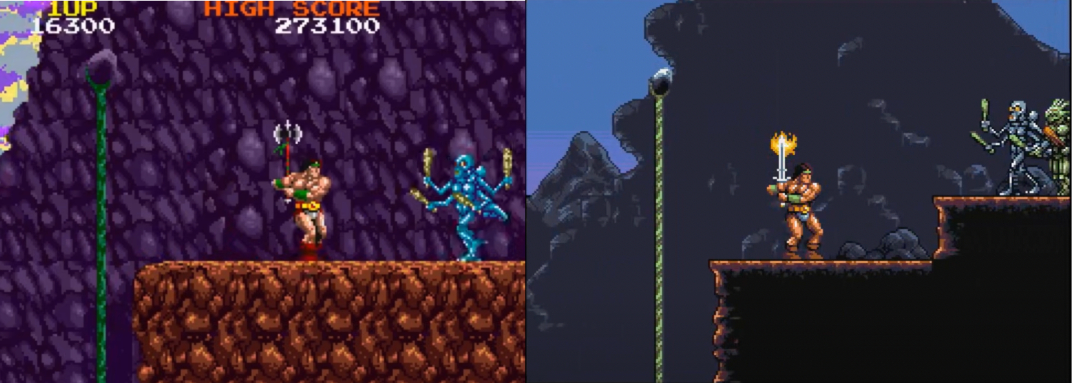
1. Background rock faces. I prefer your design to that of the arcade version. Why? Well, take a look below.
The arcade version on the left certainly has more colours, but the rows of textures get a little repetitive and is a little too cluttered.
Your version is more elegant: you just place a few details here and there that convincingly SUGGEST a rock face rather than spelling out every single detail. This is beautifully done.
Good art is about judging what to put in - but also what to leave out. Your solution here is perfect - and leaves room for our imagination to fill in the gaps.
The other great advantage of your version is that it does not distract from the foreground characters and allows them to stand out clearly.
And note how well your version creates a separation between foreground (dark area), background (grey rock face) and far background (sky). Lovely work. There's a sense of space here that is missing in the arcade graphics.
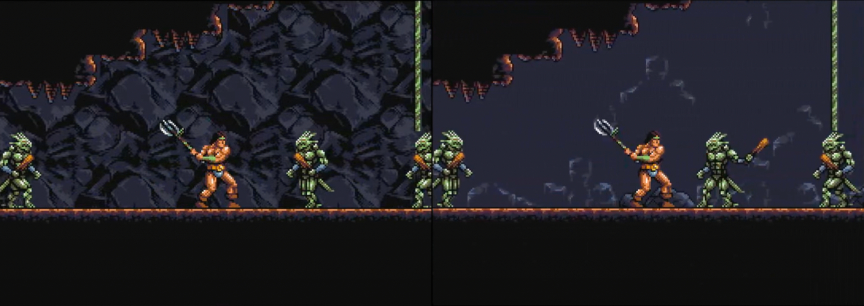
For the same reasons, although I like your new rock texture in the caves (below, left), I still think your original version (below, right) worked better.
Your original rock face may not be as pretty, but it places the cave wall further into the background, giving the characters space to breathe and allowing the action to stand out clearly.
The new rock face is very dramatic and artfully drawn, but it brings the background almost into the foreground and starts to drown out the characters. I strongly feel that this is a case of Less is More.
2. The backgrounds in the second level. The castle interiors here are perfect - far better than the arcade version. There is nothing for me to add!
3: Scrolling. In my opinion, smooth scrolling is more important than attractive graphics.
In the Youtube videos of Amiga Rastan I've watched, the scrolling seems a little juddery. Is that just Youtube, or is it like that on Amiga hardware? Also: is it my imagination or does version 0.32 scroll smoother than version 0.33?
4. Lastly, I want to address the statues. They worked fine as part of the arcade design - and the parallax scrolling really helped with that.
However, the visual design of YOUR version of Rastan is quite different - and I feel your version works a lot better without the statues. Another case of Less is More and I think you got it right the first time.
Well, that's it. Again, these are just opinions and nit-picks, and you are the boss! The work you have done is outstanding and even if you go no further, the two levels you've done are more than enough for me. I never got past the second level of the arcade version anyway!
TY for the feeedback and kind words :D I think we've got the same mindset on this kind of thing. My approach is, like you pointed out, to try and bring the action (player, enemies, projectiles, interactive thingies) into focus with stronger colors, contrast, and details. But maybe I forgot about my own guidelines a little bit trying to bring things more in line with the arcade : P The cave texture is a good example of that. What I do like about it is it makes things look less samey.. I'll give this a think.
100% agree on the statues tbh. They never made much sense to me, but again enough people missed them for me to give it a shot.
Version 0.33 uses a newer version of Scorpion so there might be some differences I need to account for there. I'll have to rework quite a few things anyway so hopefully I can get the speed back up
Thank you very much for your reply. I realise that converting Rastan is a huge job - and that you have already done an enormous amount of work on the first two levels. So I really don't want to put more pressure on you!
No doubt, lots of people besides myself are asking you to make changes: add stuff, take away stuff etc. This may not be as helpful as we intend!
Personally, I think you are the one best placed to judge what to leave in and take out. I advise taking all suggestions with a pinch of salt - including my suggestions!
Thanks again for all the effort, skill and talent you've put in to this. Back in the day, I always wanted an Amiga version of Rastan. And it's finally arrived! The version you've created was definitely worth waiting for.
Rastan is a great port on Amiga and I thank you for it a few months ago I even made a nice icon for whdload on the workbench https://zupimages.net/up/25/15/qmzz.png
Great game indeed, congratulations! Our Amiga Vault Team is specialized in the creation/conversion of Amiga games and programs in standard WHDLoad format with specific slave, custom splash screen, hybrid icon (OldIcon+NewIcon+ColorIcon) compatible with all AmigaOS, and readme file.
As we have done with some Amiga games released in recent months (Ami-H.E.R.O, Ami Robbo 2, Frank Brush, Ghosts 'n Goblins AGA, Hop To The Top, International Kopycat Plus, Kondi Krush, Metro Siege, Neon World, Pjusk, Soko-Ban, Spheroid, Trapped In The Tomb and Yoomp!) and as we will do for some games currently in development as soon as they are ready (Hyper Wings 2.21 HD, Soltys and Street Fighter), we just converted your game into WHDLoad format (look at attached pictures below:) and would like to share it with you so that, if you wish, you can include it as an additional version for the benefit of the Amiga community: what do you think of our proposal? It would be an honor and a pleasure for us to collaborate with you, if you like our idea you can contact us on facebook (user Amiga Vault) or by email (amigavault.contribution@gmail.com) if you prefer in order to define all the details.

← Return to game
Comments
Log in with itch.io to leave a comment.
This looks fantastic. Can you implement a two Button Joystick option to have jump on a separate button?
Hi, I'd like to add some comments re: the visuals that I hope will be helpful.
Firstly, the work you've done is brilliant. My comments are purely PERSONAL opinions. They do NOT mean that I am right!
1. Background rock faces. I prefer your design to that of the arcade version. Why? Well, take a look below.
The arcade version on the left certainly has more colours, but the rows of textures get a little repetitive and is a little too cluttered.
Your version is more elegant: you just place a few details here and there that convincingly SUGGEST a rock face rather than spelling out every single detail. This is beautifully done.
Good art is about judging what to put in - but also what to leave out. Your solution here is perfect - and leaves room for our imagination to fill in the gaps.
The other great advantage of your version is that it does not distract from the foreground characters and allows them to stand out clearly.
And note how well your version creates a separation between foreground (dark area), background (grey rock face) and far background (sky). Lovely work. There's a sense of space here that is missing in the arcade graphics.
For the same reasons, although I like your new rock texture in the caves (below, left), I still think your original version (below, right) worked better.
Your original rock face may not be as pretty, but it places the cave wall further into the background, giving the characters space to breathe and allowing the action to stand out clearly.
The new rock face is very dramatic and artfully drawn, but it brings the background almost into the foreground and starts to drown out the characters. I strongly feel that this is a case of Less is More.
2. The backgrounds in the second level. The castle interiors here are perfect - far better than the arcade version. There is nothing for me to add!
3: Scrolling. In my opinion, smooth scrolling is more important than attractive graphics.
In the Youtube videos of Amiga Rastan I've watched, the scrolling seems a little juddery. Is that just Youtube, or is it like that on Amiga hardware? Also: is it my imagination or does version 0.32 scroll smoother than version 0.33?
4. Lastly, I want to address the statues. They worked fine as part of the arcade design - and the parallax scrolling really helped with that.
However, the visual design of YOUR version of Rastan is quite different - and I feel your version works a lot better without the statues. Another case of Less is More and I think you got it right the first time.
Well, that's it. Again, these are just opinions and nit-picks, and you are the boss! The work you have done is outstanding and even if you go no further, the two levels you've done are more than enough for me. I never got past the second level of the arcade version anyway!
TY for the feeedback and kind words :D I think we've got the same mindset on this kind of thing. My approach is, like you pointed out, to try and bring the action (player, enemies, projectiles, interactive thingies) into focus with stronger colors, contrast, and details. But maybe I forgot about my own guidelines a little bit trying to bring things more in line with the arcade : P The cave texture is a good example of that. What I do like about it is it makes things look less samey.. I'll give this a think.
100% agree on the statues tbh. They never made much sense to me, but again enough people missed them for me to give it a shot.
Version 0.33 uses a newer version of Scorpion so there might be some differences I need to account for there. I'll have to rework quite a few things anyway so hopefully I can get the speed back up
Thank you very much for your reply. I realise that converting Rastan is a huge job - and that you have already done an enormous amount of work on the first two levels. So I really don't want to put more pressure on you!
No doubt, lots of people besides myself are asking you to make changes: add stuff, take away stuff etc. This may not be as helpful as we intend!
Personally, I think you are the one best placed to judge what to leave in and take out. I advise taking all suggestions with a pinch of salt - including my suggestions!
Thanks again for all the effort, skill and talent you've put in to this. Back in the day, I always wanted an Amiga version of Rastan. And it's finally arrived! The version you've created was definitely worth waiting for.
Hey, I hope you don't mind, but I put Rastan in the top 100 Amiga homebrew games of all time.
Damnnnnnn!
Does anyone know what settings I need to use on the Analogue Pocket Amiga Core to run this? I can't seem to get it to start.
Hi basementApe,
Great game indeed, congratulations! Our Amiga Vault Team is specialized in the creation/conversion of Amiga games and programs in standard WHDLoad format with specific slave, custom splash screen, hybrid icon (OldIcon+NewIcon+ColorIcon) compatible with all AmigaOS, and readme file.
As we have done with some Amiga games released in recent months (Ami-H.E.R.O, Ami Robbo 2, Frank Brush, Ghosts 'n Goblins AGA, Hop To The Top, International Kopycat Plus, Kondi Krush, Metro Siege, Neon World, Pjusk, Soko-Ban, Spheroid, Trapped In The Tomb and Yoomp!) and as we will do for some games currently in development as soon as they are ready (Hyper Wings 2.21 HD, Soltys and Street Fighter), we just converted your game into WHDLoad format (look at attached pictures below:) and would like to share it with you so that, if you wish, you can include it as an additional version for the benefit of the Amiga community: what do you think of our proposal? It would be an honor and a pleasure for us to collaborate with you, if you like our idea you can contact us on facebook (user Amiga Vault) or by email (amigavault.contribution@gmail.com) if you prefer in order to define all the details.
Best Regards
Amiga Vault Team
Great game . I love it. :)
wonderfull version